How to Write Website Copy That Works

The written word is a powerful tool and an especially important aspect when building a website - your online business card. Compelling website copy can lure in new customers. Bad copy will drive them away. This article will steer you in the direction of the former and help you create engaging copy when making a website that pops.
Similarly to your favorite dish that requires specific ingredients to taste just right, good website copy needs several key elements to function. These include:
- Headlines
- Subheadlines
- Call-to-action buttons
- Product or feature descriptions
- The About page
But before we learn more about each of them, we need to address the elephant in the room - SEO or Search Engine Optimization. No site can be created without taking into account SEO, as it improves the overall searchability and visibility of the webpage.
Keyword research if one of the most important and valuable activities that you can do to optimize your site - even if you're just a beginner in SEO. Use tools like Google AdWords Keyword Planner or MOZ Keyword Explorer to discover which keywords to target and include in your copy.
Now that you have your keywords ready, let's get to writing. We'll start with:
1. Headlines
Ask any copywriter, and they will tell you this: when you create a website, the first headline your visitor sees will be the most important copy you'll write. A good headline can improve conversion rates more than major changes to the website, as this test showed.
At first, it might seem rather simple to come up with a short word combination that describes your product or business. In truth, nailing the headline takes practice. But don't worry - we'll help you along the way.
First of all, being cheesy is a pitfall to avoid at all times. People like authenticity and they can detect bullshit from a mile away.
There's no need to write exaggerated headlines like “Best social media managers out there” or “Creating marketing strategies that will help your sales grow by 60%!”.
Instead, talk and write like a real person. Think about the most highly desired features and benefits of your product or software and think about what's so unique in them, what problem each feature solves. Use your headlines to answer the fundamental questions like:
- What is the product/service?
- What will you get by using the product/service?
- What are you able to do with the product/service?
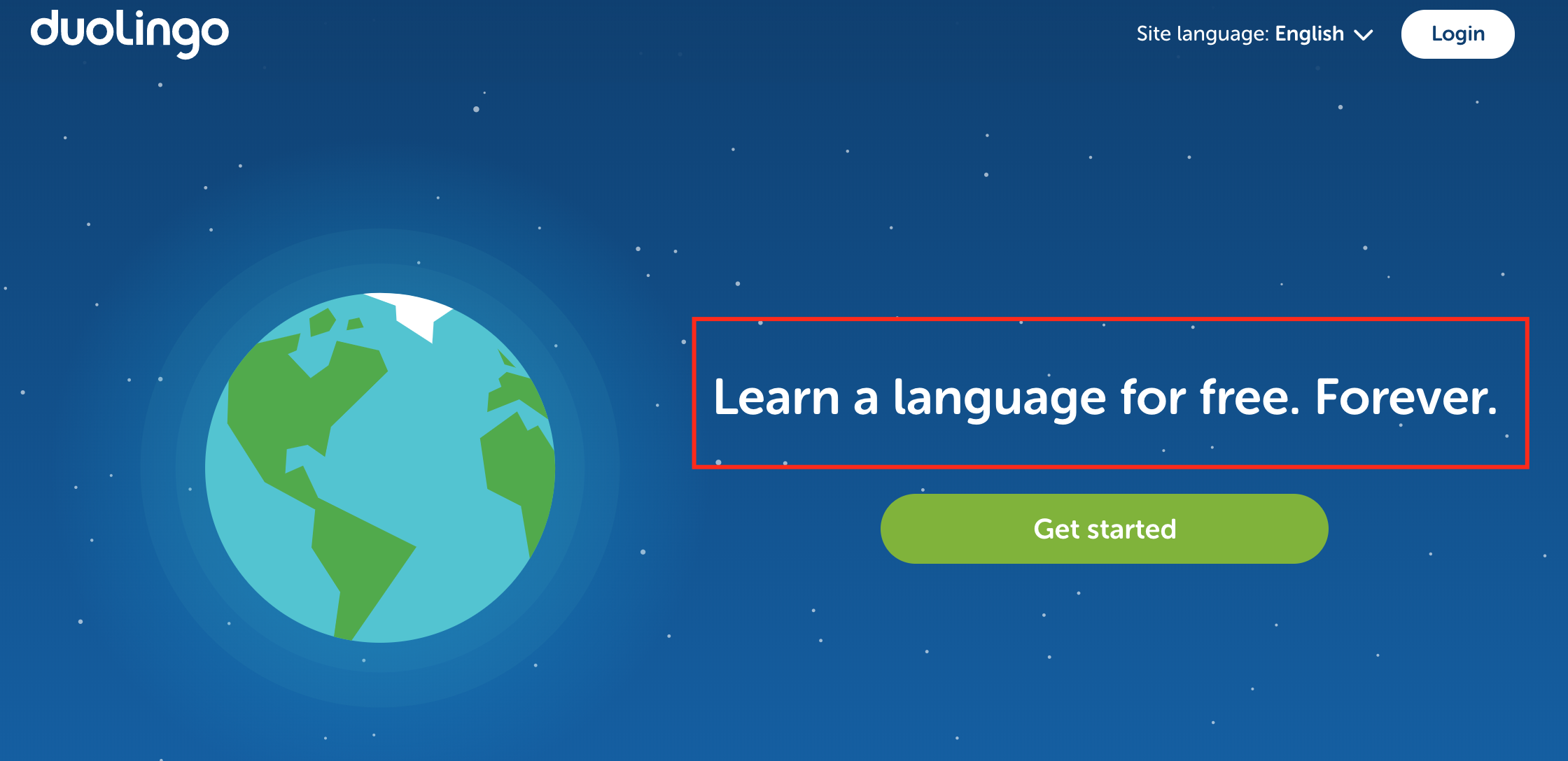
Duolingo keeps it shorts and simple, yet to the point. They emphasize what their user will gain from the app (learn a language) - and why choose them (it's free, forever):
Keep in mind that in order to deliver a more effective message, a good headline should always be a part of a larger value proposition. This means including subheadlines to clarify your message and introductory paragraphs to explain the service - we'll get to those next.
As to the length of your headline, it should hit the sweet spot of not being too long and not too short. Strive for 6-12 words for optimal length.
Here are a couple of headline formulas you can use for inspiration:
Formula 1: [Your product] for [your main target audience]
Lightweight backpacking tents for couples who travel
Formula 2: [Desired result] in [desirable time period]
Master online poker in record time
Formula 3: The ultimate [your product]
The ultimate FREE time-management app
Formula 4: A [adjective] way to [benefit]
A better way to losing weight efficiently
2. Subheadlines
The subheadline appears directly below your headline at the top of your page. Generally, the purpose of subheadlines is to expand on your main headline and get a little more in-depth about the features your product or service provides. Most probably, you've already mentioned some of them in the headline, but the reader needs constant reminding of what they'll find on your website.
While the headline is supposed to be eye-catching and give a high-level explanation of what your page is about, the subheadline offers a more detailed explanation before asking the reader to take action.
Here are several things to keep in mind when writing your subheadlines:
- Talk about benefits. Use subheadlines to expand on the benefits your product or service provides. If headlines state what's being offered and for whom, subheadlines further explain who uses it and what for.
- Strive for clarity. If readers don't fully grasp what you’re communicating with your headline, your subheadlines will clarify that.
- Don't overcomplicate. Subheadlines are usually longer than headlines, but still quite concise. Instead of superfluous writing, make your subheadlines easily digestible.
- Encourage action. A subheadline is your chance to persuade the readers to do something and drive them to your call-to-action button (CTA) below. Don't squander that opportunity!
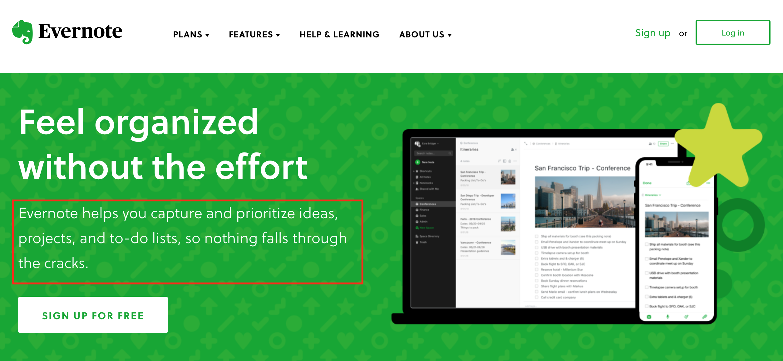
Evernote, a mobile note-taking app, lists the main features, swiftly bridging over to the call-to-action button that invites the reader to sign up for free:
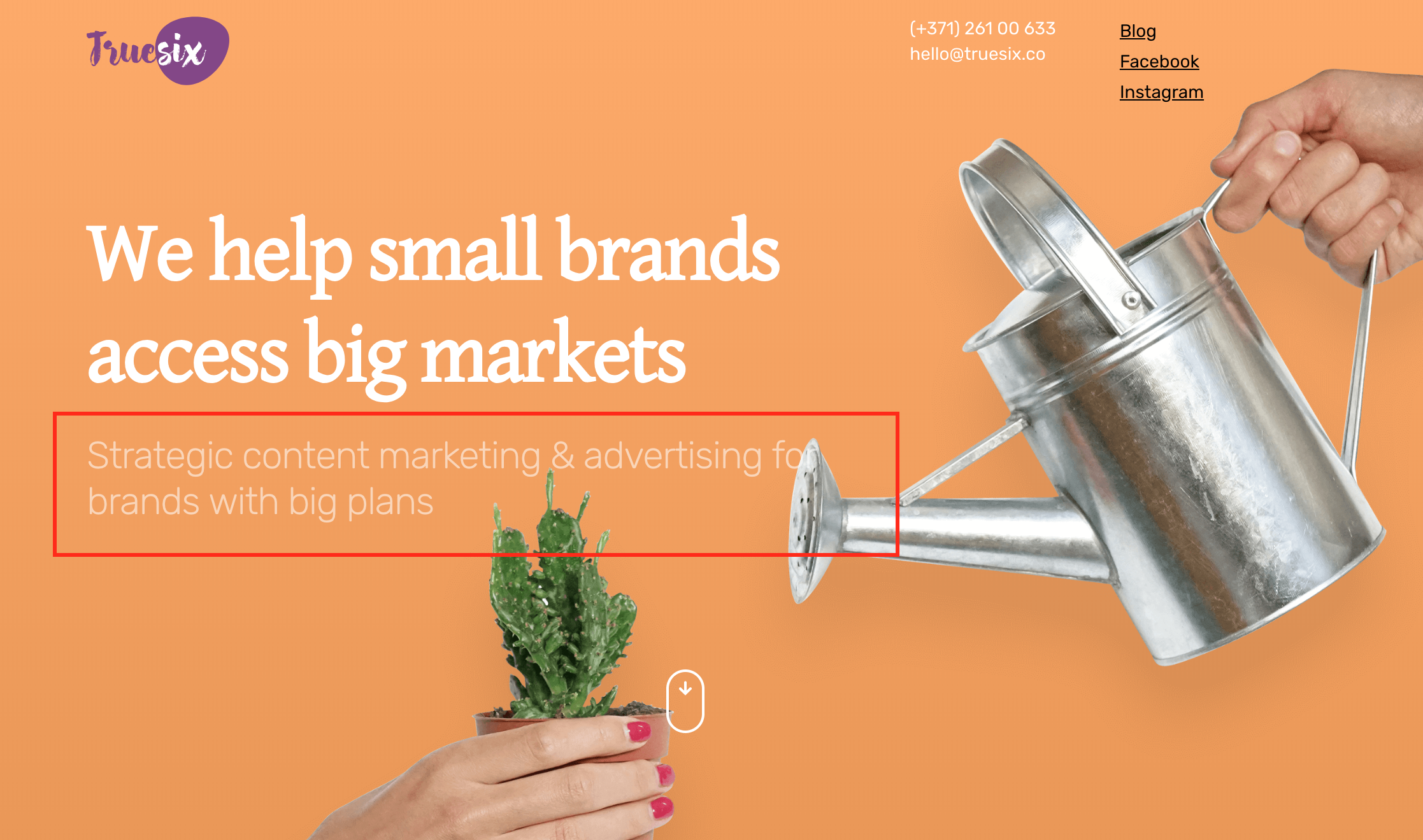
This content marketing agency uses the subheadline to clarify their headline and specify their target audience - ambitious companies that dream big:
If out of ideas, you can use these subheadline formulas:
Formula 1: [Your product] helps you [benefit 1] and [benefit 2].
Brandly helps you create stunning visuals for your projects.
Formula 2: [Your brand] is [unique feature].
Car-Yo is the only transport app that lets you browse public transit systems for free.
3. Calls-to-action
Combine a compelling headline, a good subheadline and a strong call-to-action (CTA) button, and you have yourself a reliable way to captivate your target audience and drive action.
In short, a call-to-action is a button or a link that is placed on your website with the intent to induce your website viewer to perform a specific action. CTAs can use different kinds of wording to attract attention, like “download free app now”, “start free trial”, “shop now”, etc.
Keep in mind that your call-to-action should be:
- Visually appealing. Your CTA copy should compel the website visitor to click the offer.
Action-oriented. Calls-to-action typically begin with a verb and take the form of an instruction or directive. - Clear. CTAs should be easy to understand and state exactly what the visitor will get when clicking on it. Keep it brief - up to five words is ideal.
- Easy to spot. From the visual point of view, CTAs are usually large enough to see and in a contrasting color from the color scheme of the webpage.
Here's how Netflix does it:

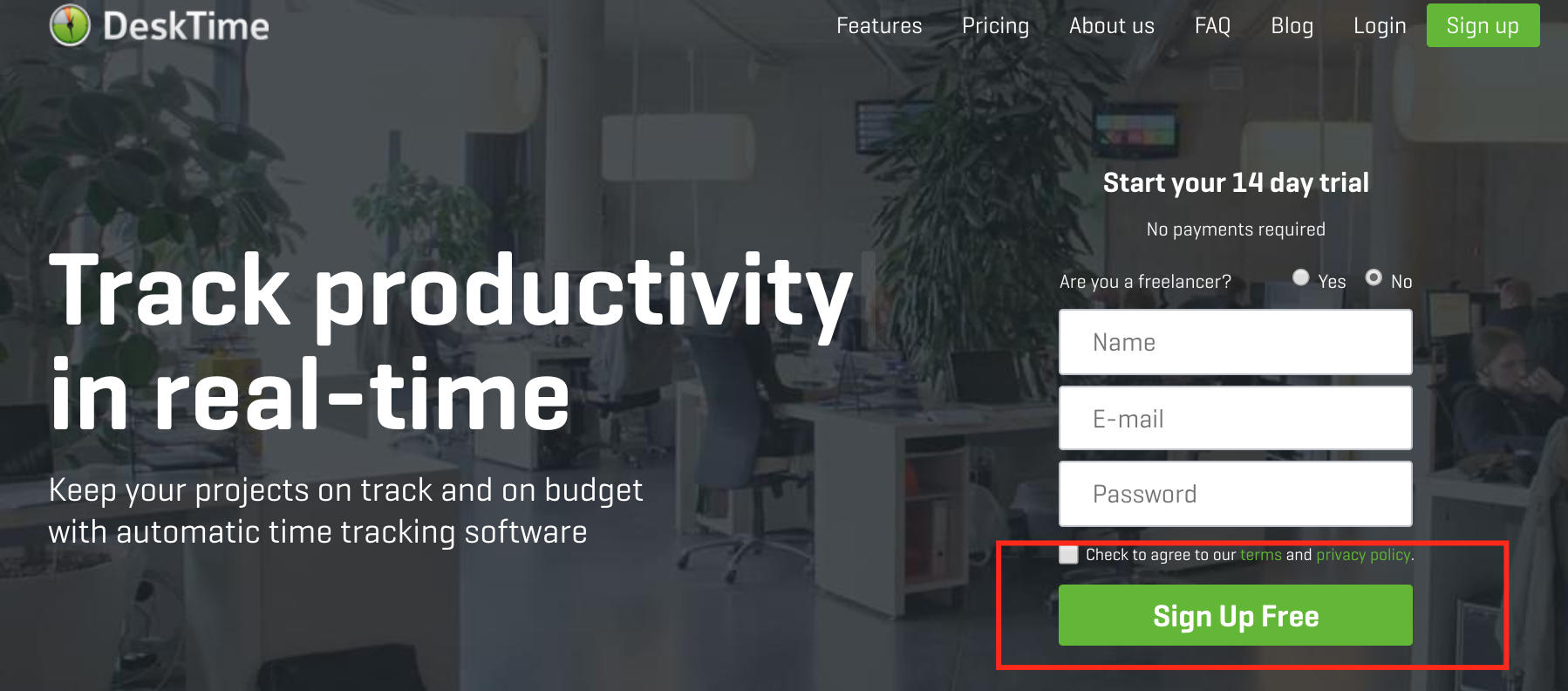
DeskTime, a time-tracking software, is an example where the CTA is not directly under the subheadline, but still visible for the viewer:
To create a call-to-action button, imagine it continuing the words “I want to”. Like so:
Formula: I want to [verb/specific act].
Register now
or
Get a FREE consultation
4. Product and feature descriptions
Now that you have the leading trio ready, what about product or feature descriptions - what's their impact on your e-commerce sales? This study found that missing or unclear product information potentially leads to 20% of purchase failures. So yes - when creating an online store, descriptions are important.
The main goal of a good product or feature description is - explain what the product does, accentuate the benefits and the reason why someone should buy it.
First, in order to write a good description for your product or service, you have to know who your target audience is. Try to understand your buyer persona - what are your customers interests, how did they arrive to your page, which features will be most valuable to them?
Then get to writing. Descriptions should be clear and concise - avoid wasting space with irrelevant words and try to give important information first.
Your descriptions should be long enough to cover the essentials, but don't drag them out to keep it interesting. Remember the sound advice of advertising legend David Ogilvy: “use short words, short sentences and short paragraphs.”
Readability matters in product descriptions, so don't be afraid to make them scannable by:
- Using bulleted or numbered lists
- Highlighting key points in bold or italic
- Using lots of white space to give the reader room to breathe
For example, German automobile manufacturer Audi combines technical features with benefits, but still keeps it rather short:
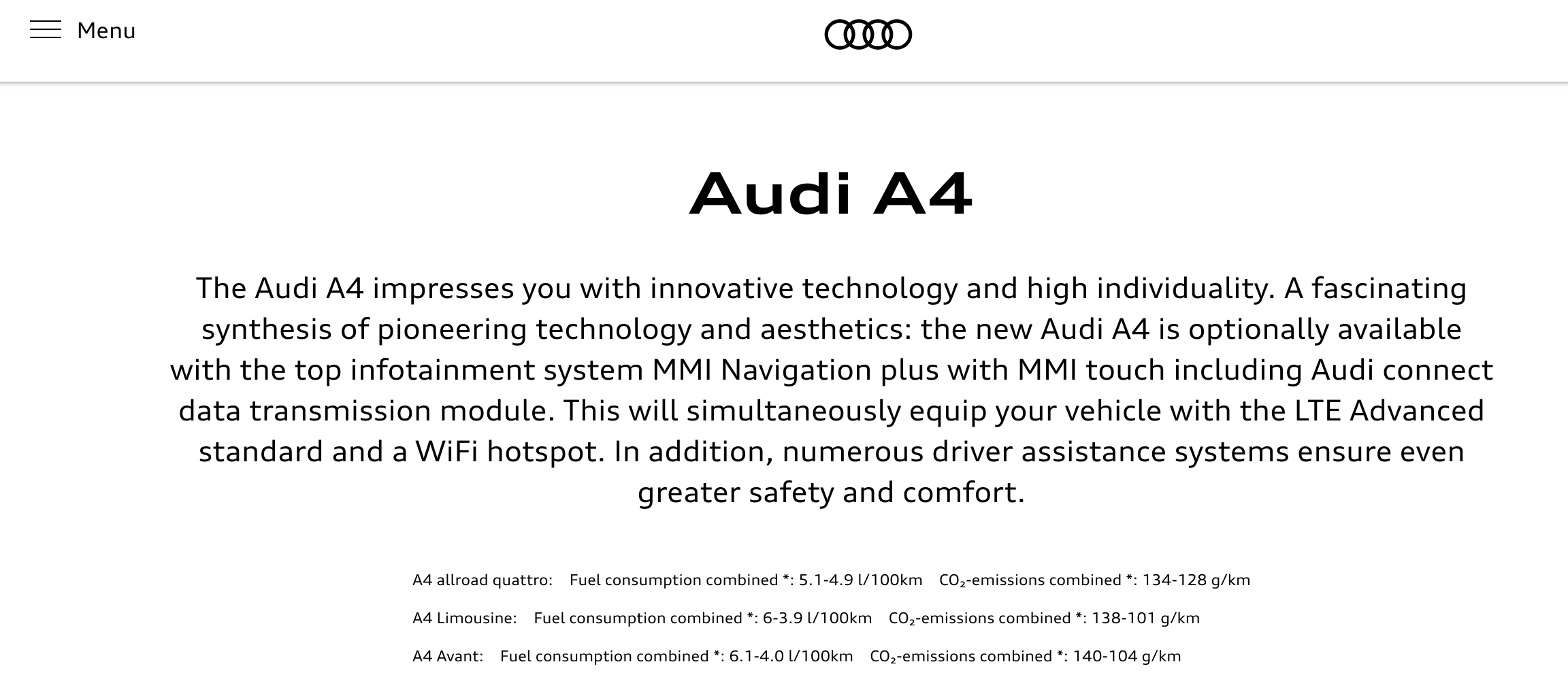
There's no correct formula to writing descriptions, as it depends on how technical your product is and what's the target audience. Besides, there can always be exceptions.
However, the bottom line is - make your descriptions clear, concise and skimmable. Include product benefits and address questions your customers might have, and that's a good start right there.
5. The About page
Look, we know that talking or writing about yourself or your product may not come easy and can even feel a bit awkward.
However, analytics show that the “About us” or “About me” section is actually one of the most frequently visited pages on any website. So it's not really a question of whether to write an About page, but how to write it well.
The About page often reflects the purpose and the personality of the business and the person or people behind it, sometimes providing the backstory of how the company came to be. Yet again, there is no one formula to write a successful description. Instead, try to follow these recommendations:
- Don't focus on yourself too much. This might seem counterintuitive, but it works. Digital marketing pioneer Ann Handley has said that “the best way to keep readers reading is to talk about them, not you.” One way to solve this is to use “you” more than “we” and “our.” Another way is to focus on the benefits and not on what your business does.
- Reflect your identity. Show your personality, corporate culture, or what your brand stands for. Use an authentic tone of voice and speak to your reader as your team actually would. That way, you’ll be more “likeable” to the reader and ensure that those who do convert are a good match for your brand.
- Include facts. Instead of boasting about your product or service, include customer testimonials, social proof, real statistics and mention industry awards. Let the facts speak for themselves.
- Add contact info. Include your address and other contact details like email address, phone number and social media profiles and make sure everything's up to date.
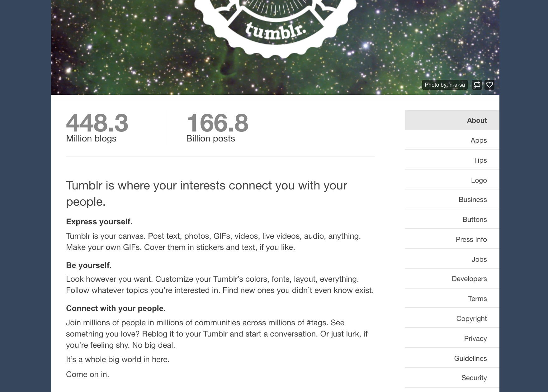
The About page of Tumblr, a microblogging website, has it all - it's captivating, easily digestible, it includes data and focuses on the reader's experience rather than blog features:
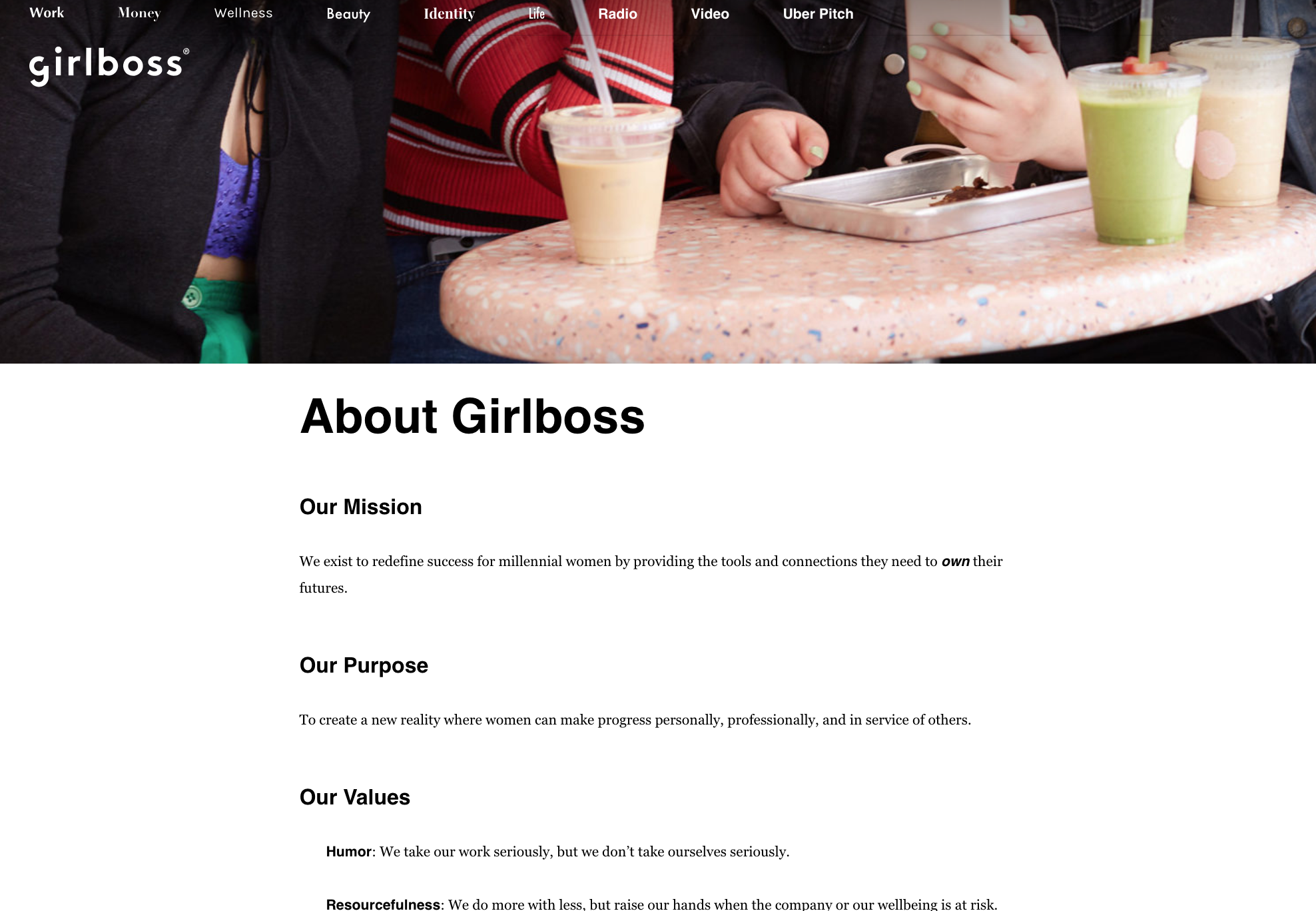
Girlboss, an empowering community for women in progress, emphasizes their key traits and values in the About section. You'll easily notice these traits appear in the rest of their content when browsing the site:
And there you have it! When you're done with the draft of your webpage copy, go over it to check for any mistakes and last-minute edits.
If it's possible, do an A/B test on your content to know if it helps or hinders sales. Compare two versions of a web page with just one varying element and see which one works better.
Other than that - your website is ready to launch!
