6 tactics to make your website sell more, and their underlying psychology

Every website owner wants the same thing: more sales.
There are two ways you can boost website sales. One, you can increase traffic to your page. And two, you can improve your website to increase its conversion rate.
According to Optimizely, ''the conversion rate is the number of conversions (eg., purchases, subscriptions, etc.) divided by the total number of visitors''. So, if a website is visited by 100 people a month and five of them make a purchase, then the website's conversion rate is 5%.
By using several tactics, you can increase the number of visitors who complete a purchase. And this goes without saying - more purchases translate to more sales and higher profits.
So, how to make your website sell more? Here are six science-backed ways:
- Simple and clear UX
- Business-appropriate fonts and colors
- Product categories
- User reviews
- Upselling and cross-selling
- Limited-time deals
1: Go for a simple and clear UX
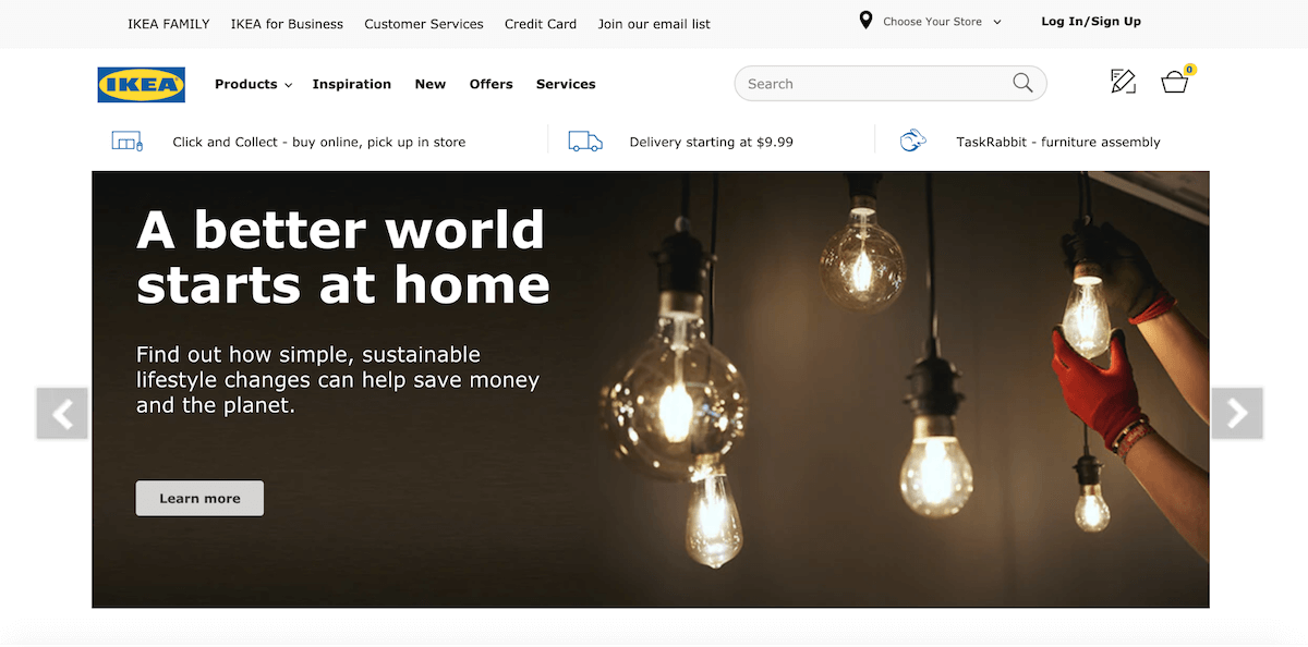
“The more, the better” applies to many things, but not to website designs. A study by Google found that users prefer ''visually simple'' websites than their complex counterparts. And not only did respondents find simple websites more appealing, but they also rated ''highly prototypical'' sites - those with layouts typically used in a particular industry - as the most beautiful.
In other words, what the study suggests is: when designing your website, don't try to be too unique and artsy - customers won't appreciate your originality, and your conversion rates might suffer. Instead, stick to the classics and respect consumers' desire for predictability when it comes to websites.
When choosing your website builder, keep in mind that the one with most features isn't always the best - sometimes, that only motivates you to make your website unnecessarily complicated.
For example, Mozello is a great option if you're looking to build a simple, user-friendly and intuitive website, and if you want to build it yourself without hiring a developer. With the Mozello website builder, your website will have all the essential components and nothing that could distract your visitors from becoming customers.
What science says
A prototypical website makes users feel comfortable. Why? Because even if they visit a particular page for the first time ever, they already know how to navigate it.
Form their previous experience in browsing websites, they know where to find the information needed. Contact page? Look in the header and/or footer. Product catalog? Check the header. Cart? Top right of the page.
Such predictability is very convenient. And ''the more comfortable users feel, the more likely they’ll continue to interact with your product.''
2: Choose business-appropriate colors and fonts
Colors and fonts contribute the most in creating the overall website feel. One study even found that adjusting colors can boost conversions by as much as 24%. Similarly, choosing the right style and size of fonts can increase your website conversion rate by a whopping 133%.
The fact that colors and fonts have such an impact on website conversions is the reason why these elements are chosen very carefully and deliberately.
What science says
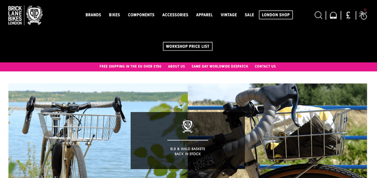
The psychology of colors is much discussed - it's been found a long time ago that our brains perceive different colors differently. Which is the best color for your website design? The answer is: it depends.
Choose colors based on what message you want to communicate to your buyers:
- Blue - professional, trustworthy, secure
- Green - calm, natural, healing
- Orange - confident, cheerful, creative
- Purple - luxury, royal, magical
- Yellow - friendly, joyful, energetic
- Red - passionate, powerful, courageous
- Grey - stable, clean, neutral
- White - cool, safe, pure
- Black - sophisticated, elegant, functional
- Pink - romantic, feminine, playful
- Brown - organic, comfortable, secure
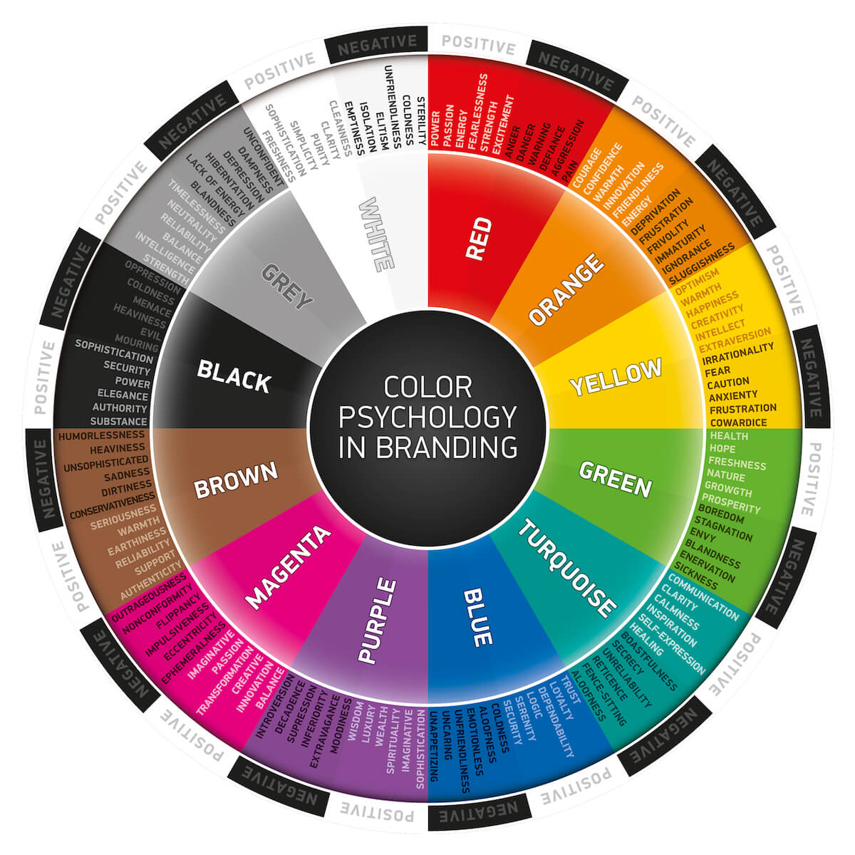
When it comes to typography, here are some of the different styles of fonts and what they say about your company:
- Serif (eg., Georgia) - established
- Sans serif (eg., Arial, Roboto, Open Sans, Lato) - straight-forward
- Script (eg., Lobster, Comforta) - creative
3: Create product categories
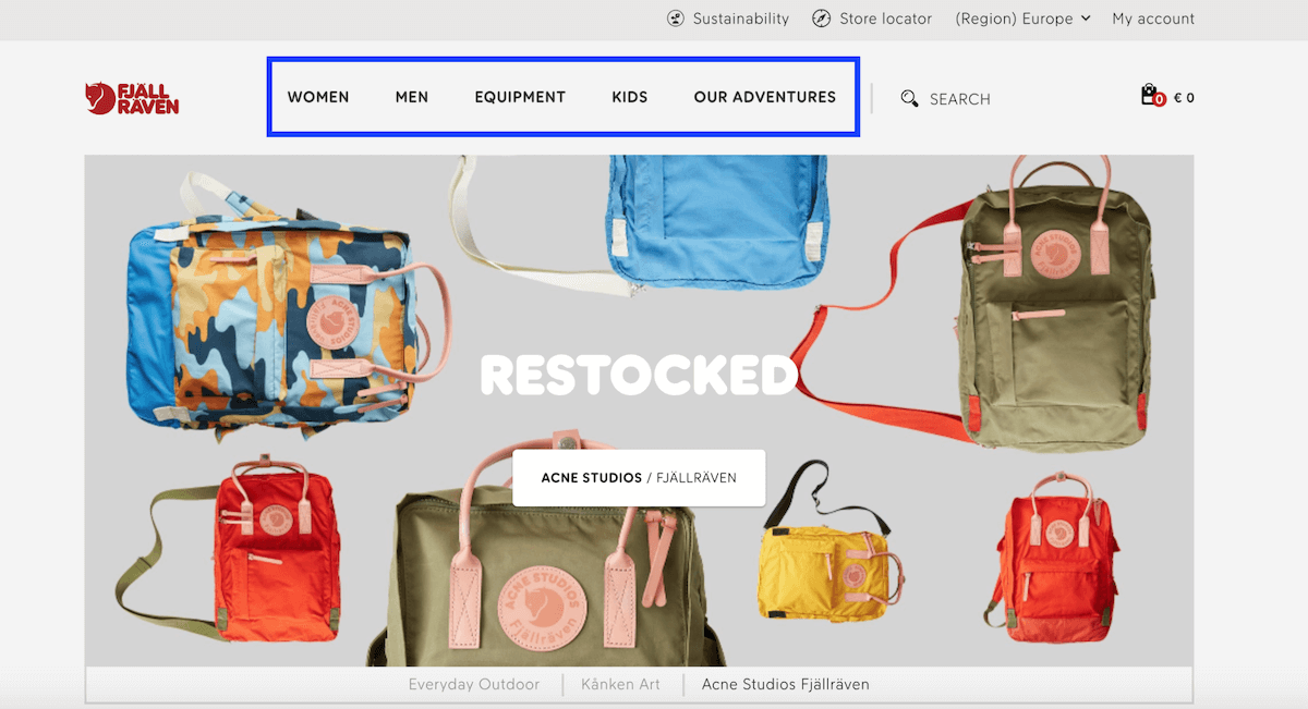
Product categories are created to organize products, whether in some sort of hierarchy or by product type.
For example, online stores that sell clothing usually categorize their products by menswear and womenswear, as well as by product type - tops, bottoms, outwear, etc. Additionally, it can organize their products in a hierarchy, for example, best-selling, recently added, and more.
Product categories make it easier for users to find what they're looking for. That, according to an experiment by Procter and Gamble, leads to a 10% revenue increase.
What science says
The paradox of choice states that when presented with too many options, people experience stress and find it more difficult to make a decision.
In one experiment, people were presented with free samples of jam - either 6 or 24 flavors. It was found that when presented with 6 options, 30% of people made a choice and picked a flavor. In the meantime, when presented with 24 options, only 3% were able to make up their minds.
Simply put, there is such a thing as too many options. Organizing your products in categories, as well as implementing a product filter, is a way for buyers to reduce the number of options, which eases the decision making process.
4: Add user reviews, testimonials, and customer photos
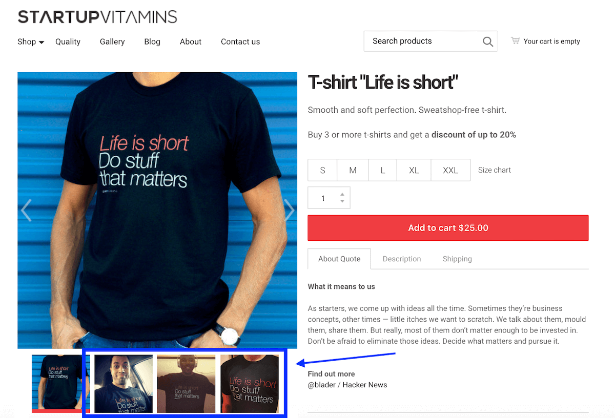
User reviews, testimonials, and customer photos have become an integral part of website design - and for a reason. It's been found that displaying user-generated content, eg., customer reviews, can boost the website's conversion rates by as much as 270%.
Now, before you ask your customers, friends, and family to give your products 5-star reviews, keep in mind this:
Products with good reviews (avg. 4.96 stars) have 23% higher conversion rates than products with bad reviews (avg. 3.31 stars). But - products with an average 4.65-star rating have 14% better conversion rates than those with 4.96.
Lesson learned? Perfect ratings make your product look suspiciously good.
What science says
Online reviews are a type of social proof - a psychological phenomenon where consumers assume that people around them (other shoppers, experts, influencers, etc.) have better knowledge about the product, and, by listening to them, one can make the right decision.
So, when the reviews state that the product is great, the right decision is to buy it. When the reviews are bad, the right decision is not to buy the product. That is the reason online sellers are fighting for good reviews - it's a way to assure store visitors that your products are worth their money.
5: Use upselling and cross-selling
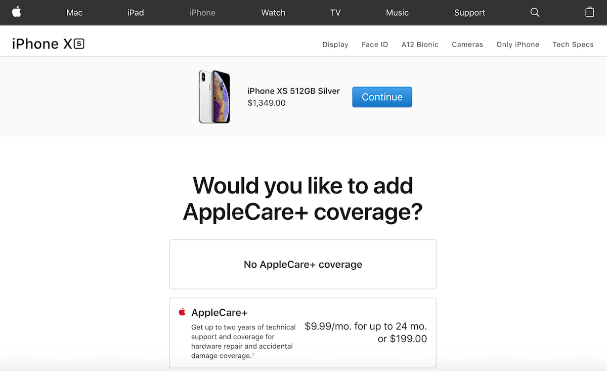
Upselling and cross-selling are two widely used tactics in e-commerce. Upselling means offering the customer a better and slightly more expensive version of the product he or she has already chosen. Cross-selling, on the other hand, means offering the customer an additional product that's related to the one that's already in their cart.
The idea behind these two tactics is that existing customers are easier to sell to. That is, when a customer has already made a buying decision, it's easier to convince them to spend more than it was to convince them to make the purchase in the first place. Studies have even found that this tactic works 60-70% of the time!
What science says
The best way to sell an expensive product? Place it next to an even more expensive product. So, if you want to sell a $1000 watch, place it next to a $5000 watch and it won't look that expensive anymore.
In psychology, it's called ''contrast effect'', and it also applies to upselling and cross-selling. When a customer buys a smartphone for $700, a case for $20 seems like a small price to pay for a matching accessory. Or - paying extra $150 for the same phone with 4x bigger memory seems like an extremely good deal.
6: Offer limited-time deals
Discounts and special offers is a proven way to increase store revenue because people just love good deals. It has even been discovered that coupons impact people’s happiness, health, and stress.
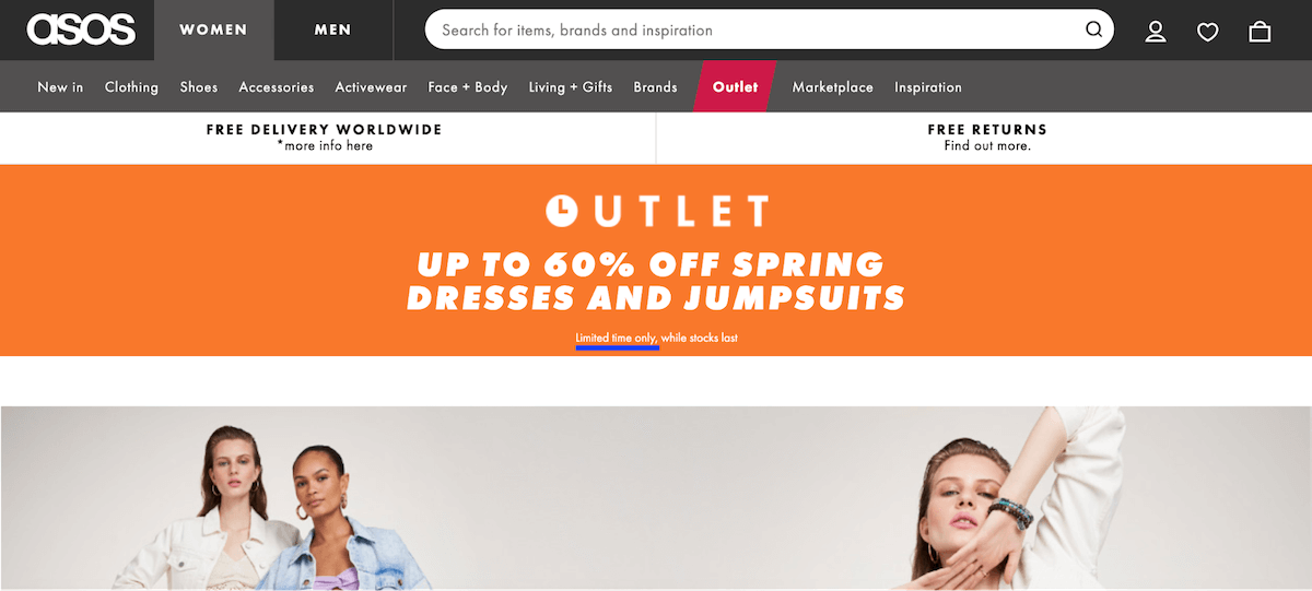
While people love all discounts, store owners prefer limited-time deals - promotions that are only available for a limited time, and that way, urges people to make their buying decisions faster. Such urgency is proven to increase conversions by as much as 332%!
Launch a deal on your website via the Mozello's built-in ''Discounts'' feature, then promote it via your social media, send out an email to your list, as well as set up a popup on your website. For a popup, use Engaga - a tool that integrates with Mozello and makes it easy to set up unobtrusive, yet effective popup messages (you'll find it under ''Extras'').
What science says
Limited-time offers create urgency, which further evokes the so-called FOMO (fear of missing out) effect. FOMO is a psychological phenomenon when people don't want to miss out on a great opportunity, especially if others are grabbing it.
FOMO is closely related to ''loss aversion'' - the human tendency to avoid any losses. According to studies, losses are psychologically twice as impactful than gains, meaning - the regret people feel if they've missed a deal is twice as strong as the satisfaction they feel when they've managed to redeem it.
Key takeaways
Today, we discussed six tactics and their underlying psychology that can help you boost your website revenue. Here's what we learned:
- Simple UX makes people feel more comfortable on your website
- Fonts and colors communicate your brand identity and values
- Product categories help people make a decision
- User reviews assure customers that they've made the right decision
- Upselling and cross-selling is an easy way to increase average cart value
- Limited-time deals play on shoppers' FOMO and make them act fast
Now, back to you - which tactic do you think has the biggest potential?
